Audio branding design case study

Use headphones for the best experience
and press the icon to trigger the journey

Intro

«Corebook» is a digital brand guideline tool to replace the outdated .pdf format brandbooks with full digital control of it: www.corebook.io

For such a grand plan as helping branding industry better display visual & sound identities, we needed to create one for ourselves.
Here is the story of «Corebook» sonic identity.

The «Corebook» slogan is «Brand guidelines in a heartbeat» and the product message is «Brand is alive» therefore concept was humming for sound design which comes from a real acoustic instrument that breathes.

Making of

The sound source is the acoustic instrument Kalimba (Mbira) which is synthesised through pure data music computer called Organelle.

Acoustic sound represents a holistic world view, life of the brand and it’s constant change. The synthesis represents the digital world where «Corebook» communicates.

Replay

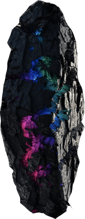
Sonic identity DNA fusion examples

It’s changing, it’s alive, but it keeps it’s voice even if it is fused with other sound substances.

Fusion
example

01

«Grinding»
Synthesising with other sounds or instruments.

Stop

Fusion
example

02

«Melting»
Slowing it down with creative approach to the sound.

Stop

Sonic identity soundscape

Creating the whole planet of sound. Unheard voices of unknown creatures. «Corebook» sound is a unique language.

Replay

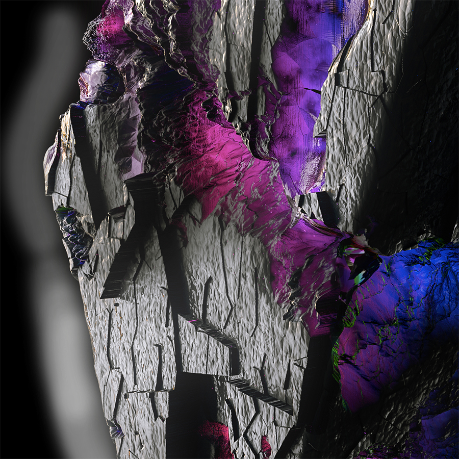
«Grinding morphosis»
Symbolises diamond in its early stage as a rough rock being formed and created with high pressure of energy.

Making of

The sound source is the Moog analog semi modular synthesizer DFAM (Drummer From Another Mother) synchronized with Mother-32

Replay

Sound of the web
application

01 Login / notify me
02 Saving..
03 Upload complete
04 Drag & drop
05 Delete

Yeah, sounds good but what is the concept again?

«Corebook» brand represents the meaning of branding itself. Every business brand always starts from a rough idea but only the strong ones are grinded to brilliance.

Our new audio branding design symbolises an image of purity and light like a diamond. They are given as a pledge of love and worn as a symbol of commitment. Each one is unique.

When you look closer on «Figure 1» and «Figure 5» you see that our colorful circle logo symbol was inside this rough rock all this time.

— This is also the story also about your brand before you get rid of all these waste layers which you have to grind to define your brand essence, message, and your unique style. The challenge is to consistently keep it clear.

Figure 1 Figure 5

Now we have a voice. And soon you will have a tool for keeping your brand guidelines respected: www.corebook.io
This is the last slide.

Creative Director: Janis Verzemnieks
Sound Designer: Evija Vebere

2024

Keep track of the full story: Facebook Linkedin Instagram
Back to Top